MAGFest 2015 – page 2
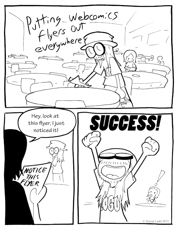
I’ve had a number of flyer designs over the years, but this one is still my favorite. I like that kind of absolute honesty in advertising.
By the way, I think the alt text here is probably funnier than the actual punchline. Alas, it just didn’t have the visual “oomph” of the fists in the air bit, and… you know, visual medium and all.
But yeah, the line between starving street urchin and webcomic artist is very thin.
(Historical Notes: Hey, Past Me! That was your cue to plug the Patreon! Get with it!)


Discussion ¬