Anime USA 2012 – page 13
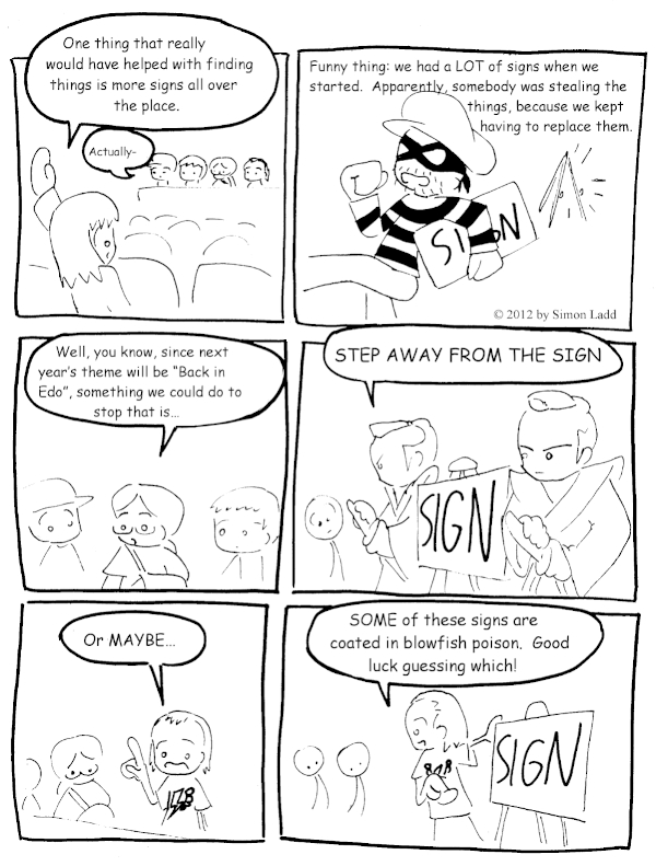
Not that I condone theft, but I can kind of understand why someone would do this. The Carnival theme they went with this year lent itself to some REALLY awesome art on all the stuff. Heck, this was actually the first time I caved in and bought an AUSA T-shirt, the design was so good!
(Historical Notes: I’m surprised I didn’t end up mentioning this more in the actual comics, but you need to understand that the new AUSA location is waaaaaaay more spread out than the old one. I kept complaining that the Hyatt was too cramped and piled on top of itself, but the Wardman Park hotel is a different kind of maze. It feels like the just kept building and building and building new wings and new wings and spreading the complex farther and father out, to the point that you really needed a thick web of signs just to keep track of what was where. One could easily feel like one had walked an entire convention’s worth of hallway between the lobby and the Dealer’s Room, and never even realize one had missed an entire building’s worth of panel rooms in the other direction. And it’s not the same as at the Gaylord, which may be even bigger but focuses all the bigness into a few obvious sections. Wardman Park is more like the hotel version of the Winchester House.)


Discussion ¬